University Flag Project
For the first project of this year we were instructed to create a flag that would represent our course as a whole. I thought that this would be an interesting brief to have a go at as I'd never designed a flag before, plus this meant that I could create a design that would be for a wide group of people all from different walks of life, by just using a few visual elements.
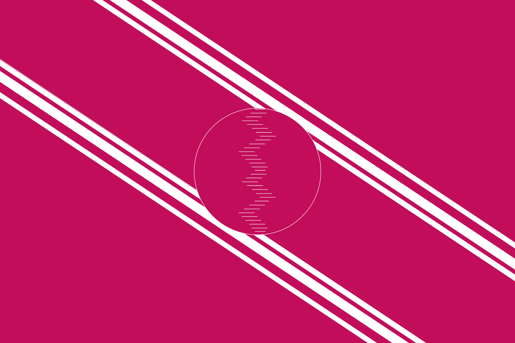
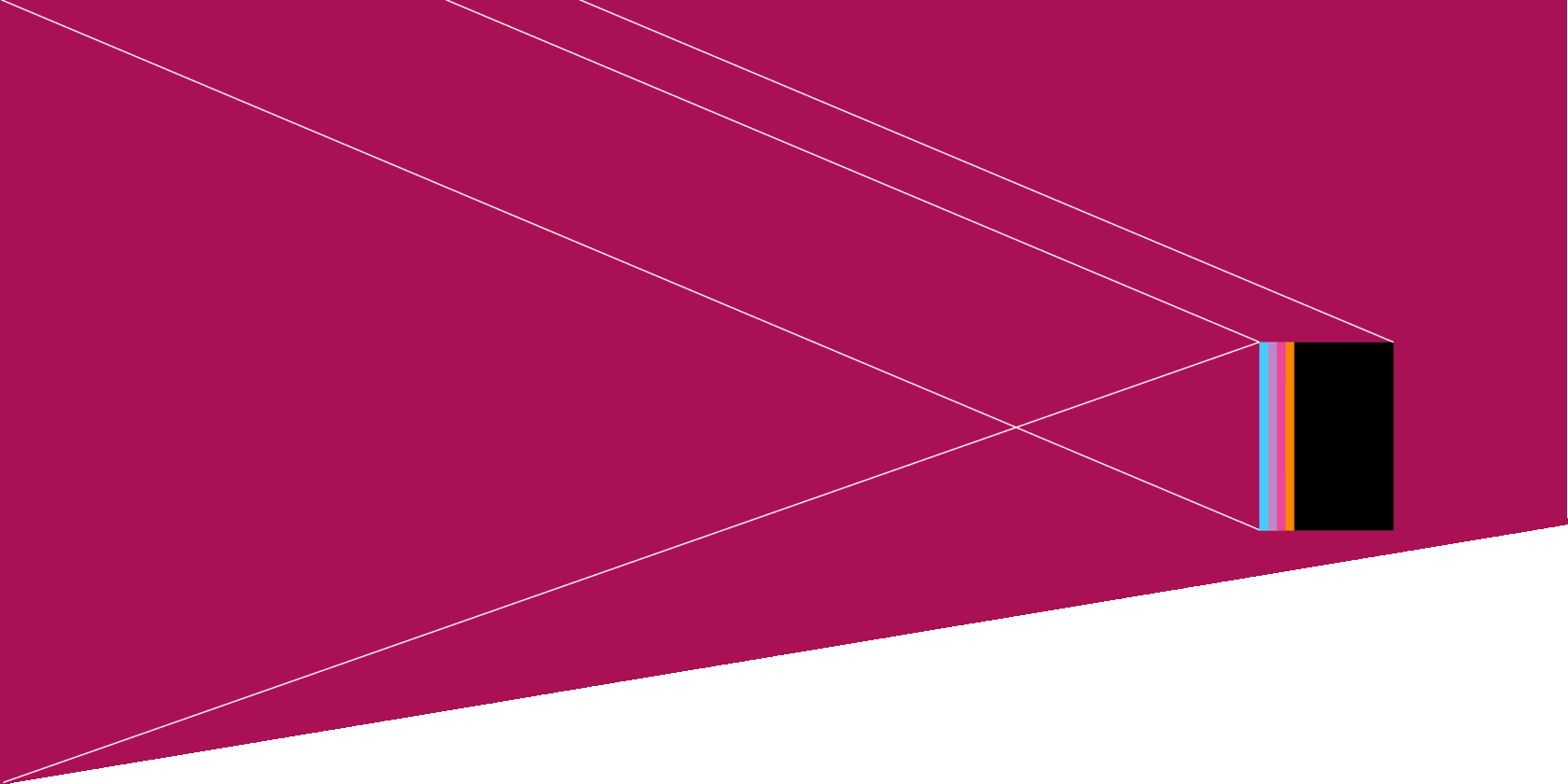

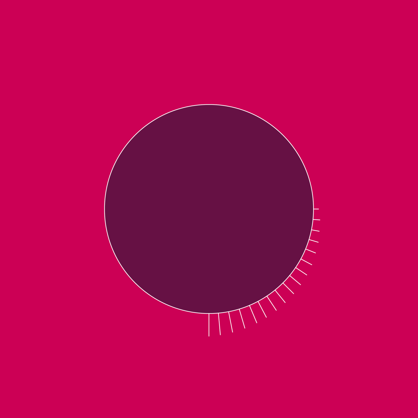
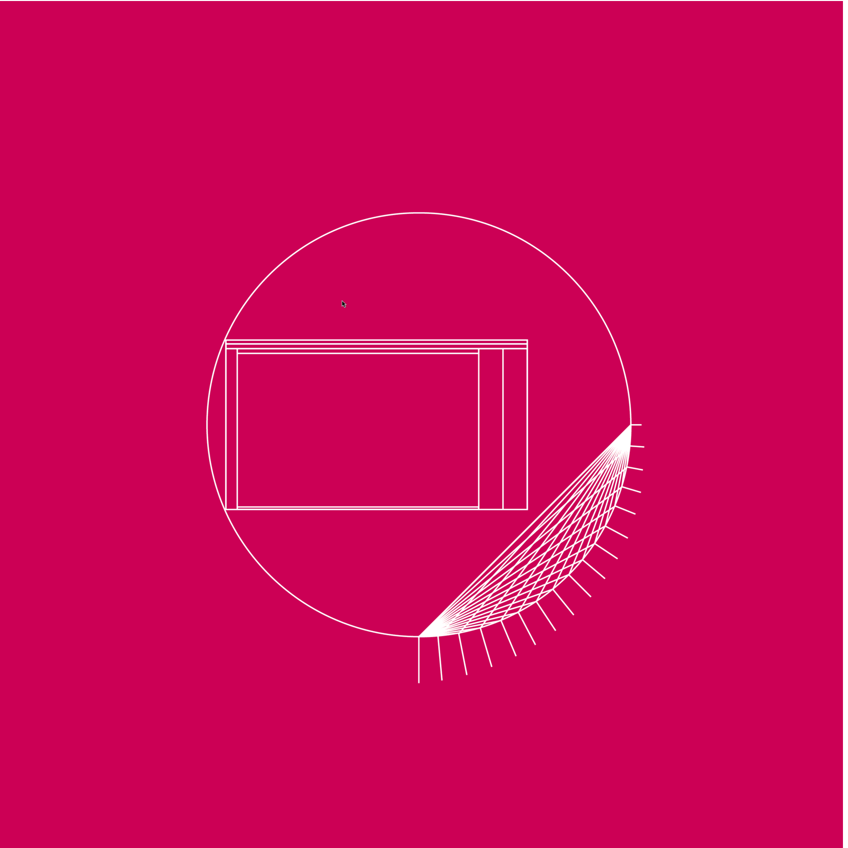
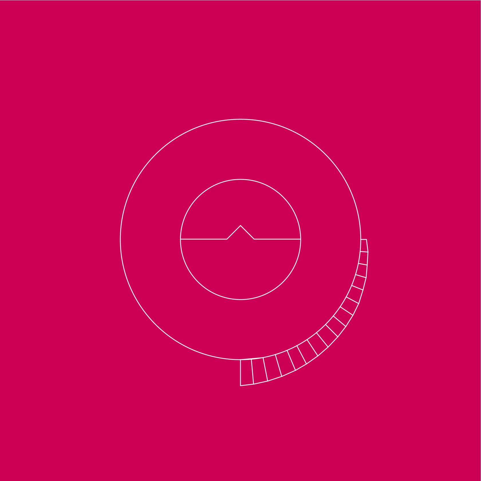
Other design variants for this design set.

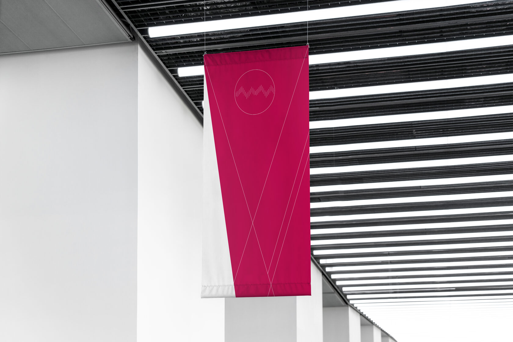
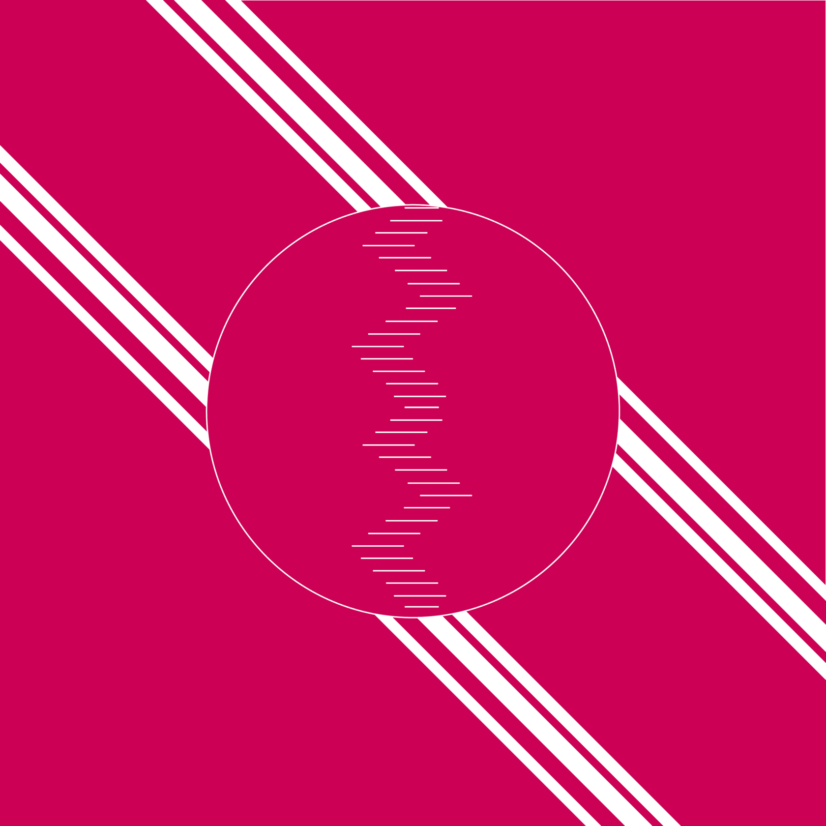
This is the design variant that I decided on for my final design. The cut away at the bottom of the flag is in relation with the 3:2 ratio mentioned previously, the white lines represent the different journeys that the different students from the course will be taking into the creative industry. The iconography to the left of the flag represents the spiral staircase that is present within the HPO arts building (where we were supposed to be our studio if it weren't for COVID), I chose this due to it being something that we had all seen in first year, and I linked very heavily to the journey to the design studios.
The consistent elements that I kept through the design ideas included the limited colour scheme being influenced from Sheffield Hallam University. In addition to this, I wanted to have a minimalist vibe for the illustrations and visuals present on the flag itself.
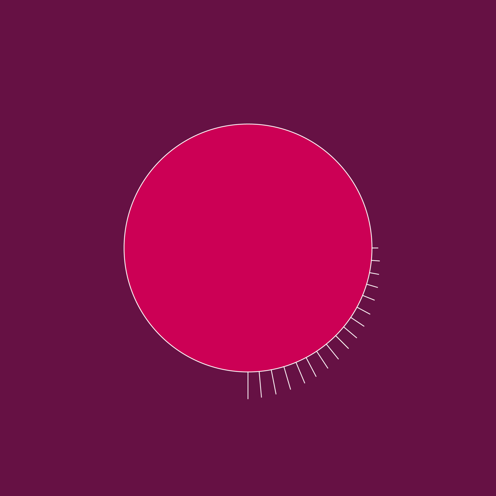
I started off in a 1:1 ratio for the flag, taking inspiration from the flag of Switzerland, however after a while I decided on using a 3:2 ratio as a way to represent the depreciation from ~150 students to ~100 students in the class. Plus, this rectangular formatting of the flags form suits the traditional appearance of a countries flag.
I started off in a 1:1 ratio for the flag, taking inspiration from the flag of Switzerland, however after a while I decided on using a 3:2 ratio as a way to represent the depreciation from ~150 students to ~100 students in the class. Plus, this rectangular formatting of the flags form suits the traditional appearance of a countries flag.
DESIGNS BY ZAC MASON
