ISTD 'Silence is Golden' Project
For the third project of this year, I decided to focus on the ISTD project based on the topic of silent cinema. I chose this due to it being a visual style that I had always been interested in but had never studied in depth. Because of this, I thought that I would focus the design of the publication to be around the visual elements found within the aesthetics and techniques of silent film, hence the name Silence is Golden.
Switches in typography choices
Front cover alternatives
These different variations occurred over the course of several months due to personal and peer reviewed design changed. The front cover designs were all of my own decision, while the decision of which one I'd use was opened up to a group of my peers. The typography change was suggested by my tutor due to the swiss style of font not fitting with the topic. I switched the title type to a Polish typeface called "Antykwa Poltawskiego" and the body type was switched to a typeface by Jan Tschichold called "Uhertype-Standard-Grotesk", both of which were created in parallel to silent cinema.
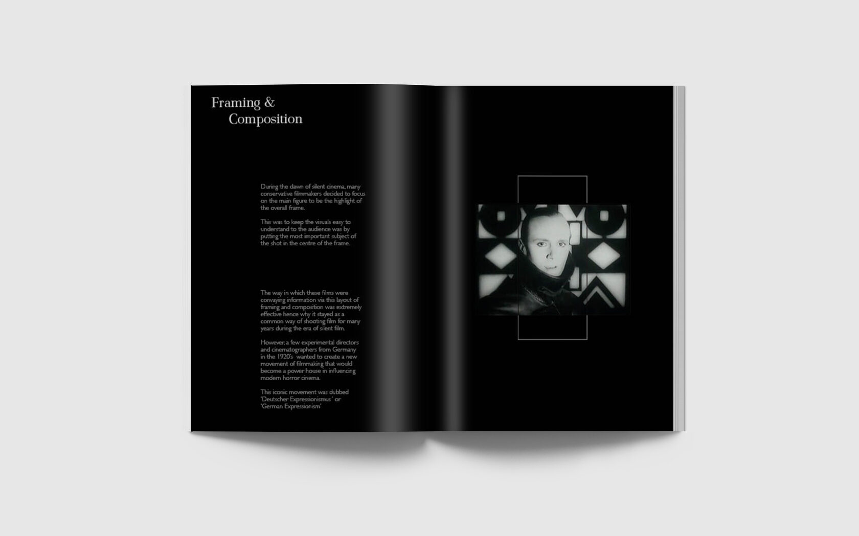
Below are the finished mock-up spreads from my finished publication. With the final results of the project, I think that the consistent visual language is extremely effective within this publication. Each of the topics within the book have a unique style that is influenced by the content spoken about within the written elements of the publication.
DESIGNS BY ZAC MASON
